
Joe Gibbs Racing faces backlash over new logo. Fans are speaking out, criticizing the change, but what they don’t know is that this new design honors the legacy of Coy Gibbs, a key figure in the team’s history. While some fans miss the old logo, this redesign holds a deeper meaning tied to the family’s racing heritage. Why did Joe Gibbs Racing make this decision, and what’s the true significance behind it?
Key Highlights
- Joe Gibbs Racing’s new logo honors Coy Gibbs, incorporating elements from his motocross passion, but has faced backlash from fans.
- Fans express disappointment over the departure from the traditional iconic logo, citing it as creatively superior.
- Mixed emotions and skepticism arise due to the simplification of the new logo’s design.
- Many fans are unaware of the new logo’s significance as a tribute to Coy Gibbs.
- Joe Gibbs Racing plans to evaluate fan response and may adjust branding strategies based on feedback.
Ty Gibbs’ Rise in NASCAR and Family Legacy
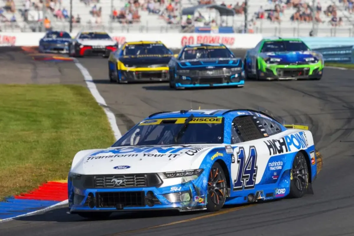
In the high-octane world of NASCAR, Ty Gibbs has swiftly emerged as a formidable competitor, carrying the storied legacy of the Gibbs family into the future. With a racing pedigree that blends grit and determination, Ty Gibbs has advanced from the Xfinity Series to the prestigious NASCAR Cup Series with notable success. His full-time engagement in the NASCAR Cup Series began in 2023, and just a year later, he achieved the notable milestone of cracking the playoffs in 2024. This accomplishment highlights not only his talent but also his dedication to the sport.
Ty’s path in NASCAR has been punctuated by a series of triumphs in the NASCAR Xfinity Series, where he claimed 11 race victories across two seasons, 2021 and 2022. His crowning achievement came with securing the NASCAR Xfinity Series championship, a proof of his skillful driving and tactical expertise on the race track. These milestones not only showcase Ty’s capabilities but also echo the competitive spirit of Joe Gibbs Racing, a team deeply woven into the fabric of NASCAR history.
Amidst Ty’s rising career, the legacy of his father, Coy Gibbs, remains a poignant chapter in the Gibbs family narrative. Coy Gibbs, who competed in the Xfinity and Truck Series from 2001 to 2003 and later served as vice chairman and chief operating officer of Joe Gibbs Racing until 2022, is remembered fondly.

Joe Gibbs Honors Coy Gibbs with a New Tribute
Amid the evolving landscape of Joe Gibbs Racing, a poignant tribute has been introduced to honor the late Coy Gibbs. Recognizing his profound influence on both the family and the sport, Joe Gibbs has orchestrated a meaningful homage that resonates deeply within the racing community.
Coy Gibbs, remembered for his notable role in the JGRMX team, left an indelible mark on motorsports, a legacy that Joe Gibbs aims to enshrine with this new tribute.
Joe Gibbs Racing has made a thoughtful decision to incorporate elements of Coy’s passion for motocross into their broader identity, symbolizing the enduring impact he had on the sport. This tribute not only highlights his contributions but also serves as a guiding light of inspiration for future generations.
#NewProfilePic pic.twitter.com/MFfepOdur7
— Joe Gibbs Racing (@JoeGibbsRacing) January 6, 2025
The integration of these elements into the team’s ethos emphasizes a commitment to honoring Coy’s legacy.
Key Aspects of the Tribute:
- Legacy Integration: By weaving the core of Coy’s motocross achievements into the team’s identity, Joe Gibbs Racing guarantees his contributions remain a crucial part of their narrative.
- Motorsports Symbolism: The tribute reflects Coy’s path from a young motocross enthusiast to a pivotal figure in JGRMX, celebrating the milestones he achieved in the sport.
- Enduring Influence: This homage extends beyond mere recognition, aiming to inspire and remind current and future team members of the passion and dedication Coy exemplified.
Discovery of Coy Gibbs’ Motocross Logo and the Emblem Change
Through the lens of cherished memories, the recent unveiling of Coy Gibbs‘ motocross logo has sparked a groundbreaking moment for Joe Gibbs Racing. Unearthed by Schaffer during a time of mourning, this emblem of past endeavors now represents more than nostalgia; it stands as a poignant tribute to Coy Gibbs’ enduring influence within JGR.
Initially found as a piece of memorabilia, the logo’s importance has since evolved, culminating in its adoption as the official emblem of the Joe Gibbs Racing NASCAR team.
The new logo, with its bold black ‘JGR’ lettering, marks a notable departure from the traditional emblem featuring a checkered flag and crimson initials. This shift is described by Schaffer as an homage to Coy Gibbs, ensuring his legacy remains a constant presence within the family and organization.
Schaffer noted that the decision to adopt the motocross logo was partly inspired by Heather’s desire to see the emblem on t-shirts worn by NASCAR Xfinity drivers, a gesture that brought joy to the Gibbs family.
This emblem change is more than a rebranding; it encapsulates the spirit and vision Coy instilled in the team. While honoring his memory, the logo also aims to bring renewed energy and a fresh perspective to JGR’s operations within the competitive sphere of NASCAR.
As Schaffer emphasized, the logo is not only a tribute but also a tactical move intended to benefit the company, adding a layer of innovation and excitement to the storied racing team’s future endeavors.

NASCAR Fan Reactions to Joe Gibbs Racing’s New Logo
Revealing the new logo for Joe Gibbs Racing has stirred a mix of emotions among NASCAR fans, sparking considerable backlash. The emblem, intended to honor Coy Gibbs’ legacy, has been met with criticism from a community that appears largely unaware of its importance. Fans have voiced their disapproval, labeling the change a “downgrade” from the previous design, which was regarded as more creative and visually appealing.
“Bruh why the old logo was great. No need to fix what isnt broken.”
“Old logo is waaaaaaay more creative and iconic. This trend of over simplified logos is very boring.” – NASCAR fans reaction
This negative reception highlights several key aspects of the fan base’s response:
- Nostalgia for the Previous Logo: Many fans expressed a strong attachment to the former logo, describing it as iconic and creatively superior. This sense of nostalgia often overshadows the appreciation for the new design’s symbolic value.
- Skepticism Towards Simplification: There is a growing sentiment among fans that the trend of simplifying logos, as seen with Joe Gibbs Racing’s new emblem, results in less engaging designs. Fans lament the loss of uniqueness and complexity that older logos embodied.
- Lack of Awareness of Coy Gibbs’ Legacy: The backlash reveals a notable gap in understanding the new logo’s tribute to Coy Gibbs, hinting at the need for better communication from Joe Gibbs Racing to educate fans on the emblem’s deeper meaning.
As Joe Gibbs Racing continues to navigate these reactions, it becomes evident that reconnecting with fans through open dialogue and education is essential.
Only then can the community fully appreciate the emblem’s homage to Coy Gibbs’ contributions, bridging the gap between legacy and modernity in NASCAR branding.
Support for the New Logo and Understanding Its Significance
Despite the initial backlash from fans regarding the new Joe Gibbs Racing logo, there exists a growing faction that appreciates its significance and supports the change. The redesign is not merely a visual update but a heartfelt homage to Coy Gibbs, a key figure in the team’s history.
While some fans have criticized the logo for lacking high-resolution quality and aesthetic appeal, others have taken the time to understand its deeper meaning, recognizing its historical and practical advantages.
“For the love of god. Can organizations in all sports stop getting rid of logos that have personality for cookie-cutter soulless things like this?”
“For those that don’t know, this is the font Coy Gibbs used for their MX team logo. It’s a nod to the family heritage while also making their logo look more legible at a smaller scale. The old logo was hard to read at a distance on the nose of the car; this will be more legible.” – NASCAR fans reaction
The updated logo employs the font used by Coy Gibbs for the motocross team, underscoring a connection to the family’s legacy in motorsports. This choice is not only a tribute to Coy Gibbs but also improves the logo’s functionality.
The previous logo, while iconic, often posed challenges regarding legibility, especially when viewed from a distance on racing vehicles. The new design addresses this issue, ensuring clarity and readability even at smaller scales, a vital factor in a fast-paced sport like NASCAR.
This change reflects a tactical decision to honor family heritage while meeting the demands of modern branding. Fans who grasp the significance of this alteration argue that the logo stands as a proof of Coy Gibbs’ lasting impact on the racing world.
In a domain where visual identity holds substantial weight, the logo serves as a bridge between past achievements and future aspirations. As the racing community adapts, it’s evident that the logo’s true value extends beyond aesthetics, embodying a legacy that will endure.
News in Brief: Joe Gibbs Racing Faces Backlash Over New Logo Change
The recent logo change by Joe Gibbs Racing has sparked varied reactions among NASCAR fans, reflecting the emotive complexities of honoring Coy Gibbs’ legacy. The new emblem incorporates elements from Coy Gibbs’ motocross logo, signifying a tribute to his contributions.
While some fans express dissatisfaction, others appreciate the homage, recognizing its importance to the Gibbs family and Ty Gibbs’ NASCAR path. The logo serves as a meaningful symbol within the motorsports community, illustrating the enduring impact of familial and professional legacies.
ALSO READ: Joe Gibbs Racing Reveals NASCAR Car Sponsorship Rules: A Behind-the-Scenes Look
